Project
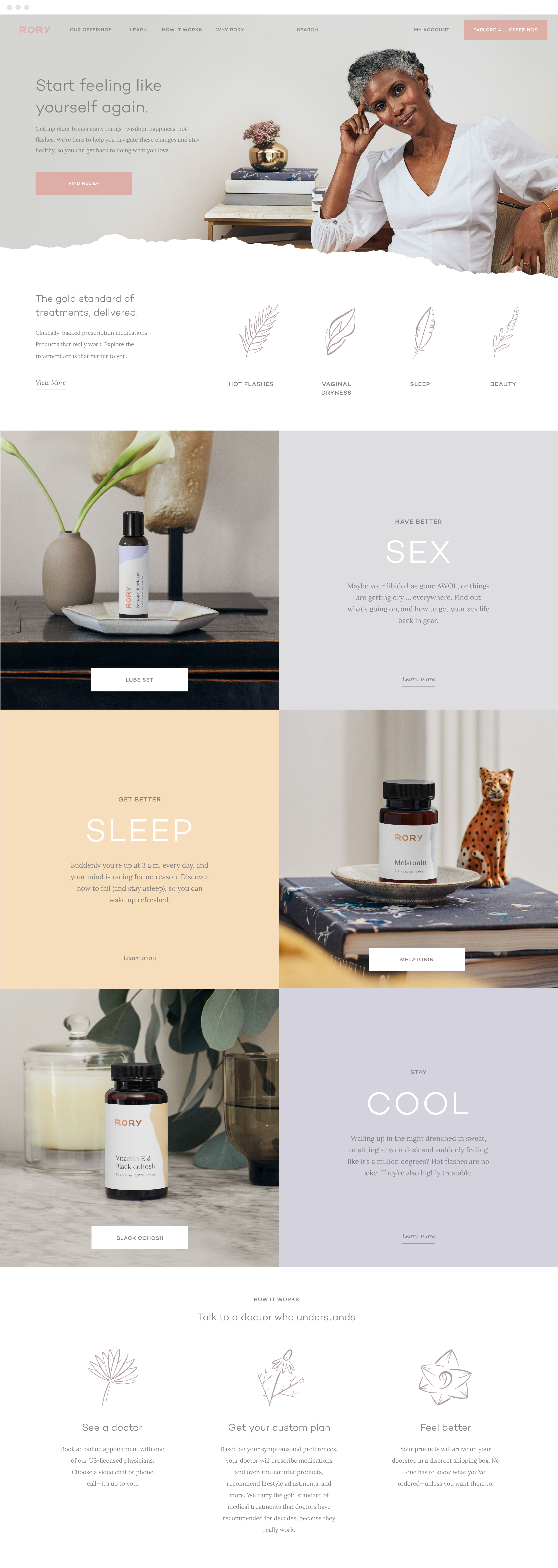
Rory is filling an unmet need for the modern woman: accessible, high-quality healthcare for the years leading up to menopause and beyond. We worked with Rory from inception through launch to create a brand experience that’s focused on improving the quality of life for millions of women. Rory’s audience is older (40-65), and not digital-native. Going online to access healthcare can be an unnerving (and new!) experience. To build trust, we created a visual system that channels femininity and maturity. Our messaging is focused on clear, informative, nonjudgmental language infused with the empathy we all seek in a healthcare experience.
Scope
Art Direction
Brand Strategy
Brand Voice
Content Creation
Messaging
Naming
Packaging System
Print Collateral
Site Design
Visual Identity
Collaborators
Heather Moore – Photography
Gregory Reid – Photography
Mariana Velasquez - Stylist
Annie Caruso - Stylist


Brand Manifesto
“Aging well” means something different to every woman. Maybe menopause is miles away for you. Or maybe it’s happening right. This. Minute. We’re here to lift the curtain on all the ways our bodies change as we get older. From thinning hair to low libido, from vaginal dryness to sleep problems, nothing is taboo. And nothing requires you to simply “grin and bear it” like our grandmas did. Here at Rory, we are providing accessible, personalized, high-quality healthcare from doctors who get it, and a community to support and empower women every step of the way. Knowing what to expect is half the battle. The other half is getting the care you need, when you need it. You can count on Rory for both.
Rory. Lots of support. No surprises.



Package Design
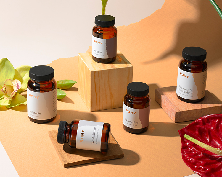
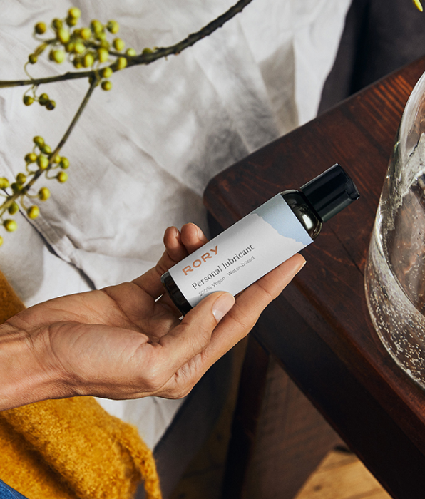
We focused on infusing the packaging experience with warmth, beauty, and approachability.


Package Design
Sensitive to the embarrassment around menopause, we created packaging that was discreet, but a pleasure to interact with.


To capture Rory’s diverse community of women, the photography features moments of ease and relaxation at home, showing how Rory fits seamlessly into women’s lives.


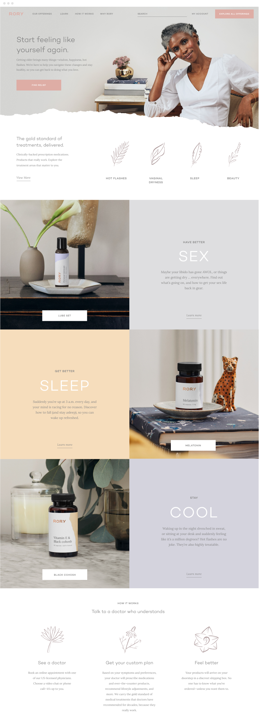
We dialed up the warmth and approachability of the digital experience by adding new elements, like botanical illustrations, while expanding the torn paper motif.
