Project
Ollie makes premium, all-natural dog food customized to each pup’s needs and delivered to their human’s doorstep. We partnered with Ollie to capture the friendly, dog-loving spirit at the heart of the brand, as well as its uniquely modern approach to dog food. Instead of using an earthy color palette like so many health-focused brands, we opted for a vibrant, fresh, and unexpected palette with plenty of white space to give Ollie a modern-yet-premium feel—setting it apart from its competitors. We created a bold logomark, playful illustrations and, of course, lots of dogs. The result is a brand experience that’s every bit as delightful as a product for humans as it is delicious for dogs.
Scope
Art Direction
Content Creation
Illustration
Packaging System
Print Collateral
Site Design
Visual Identity
Collaborators
Henry Hargreaves – Photography
Kent Rogowski – Photography
Caitlin Levin — Stylist


Packaging Design
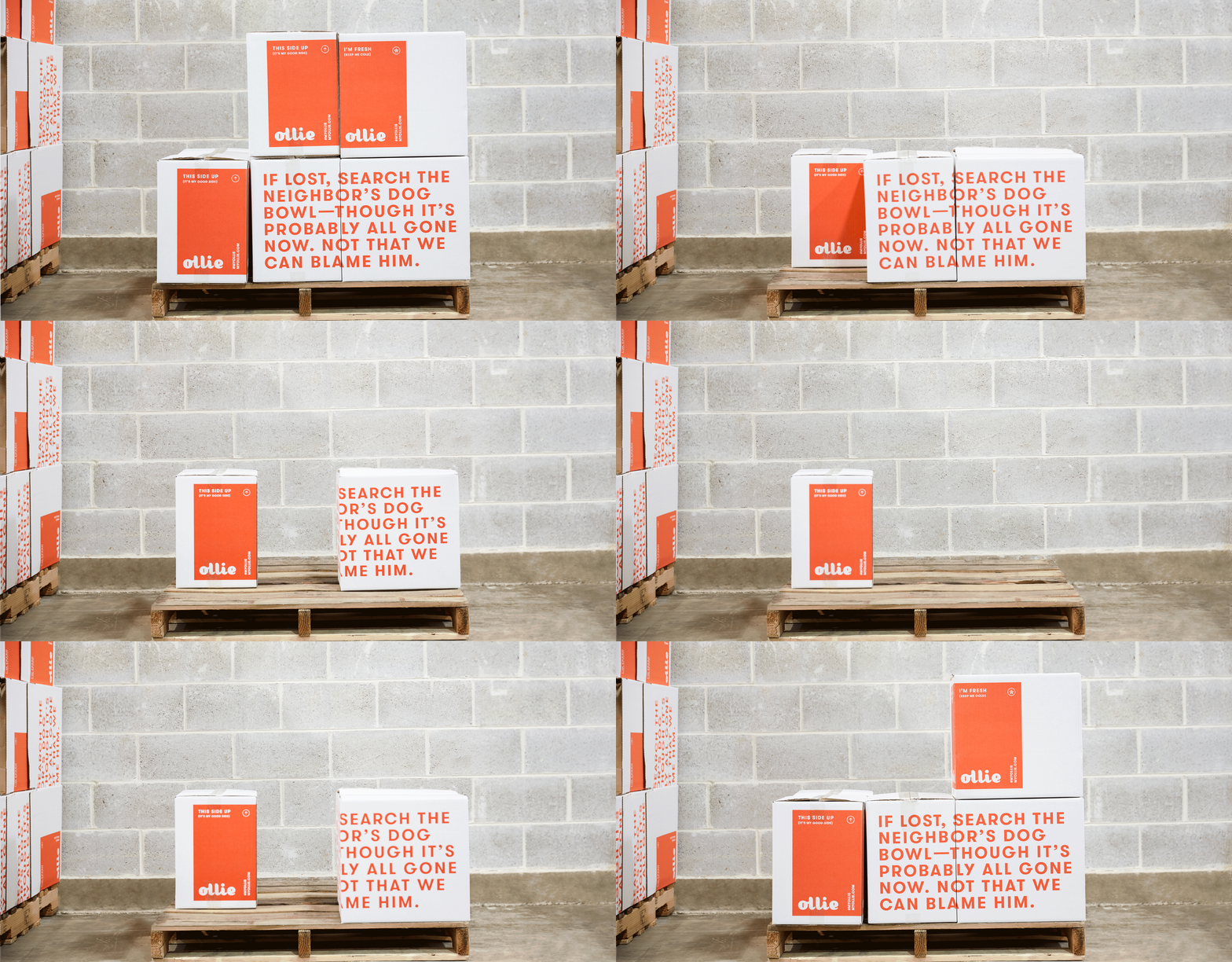
We created a custom wordmark to evoke the warm, friendly vibe at Ollie’s core, pairing it with graphic visual language to tell a story from the moment the box arrives on the customer’s doorstep.


ILLUSTRATIONS
Playful pup illustrations added to small print moments brings a pop of personality and fun to both the products and packaging.


INGREDIENT IMAGERY
We used fresh food set against brightly colored backgrounds in our product photography to create playful patterns, highlighting the premium quality of Ollie’s dog food.


Lifestyle Photography
Lifestyle imagery was shot in a bright, natural style to emphasize the special connection between pup and human.


We designed the site experience to incorporate moving ingredients and big-scale brand photography to capture Ollie’s friendly, dog-loving spirit.


