Project
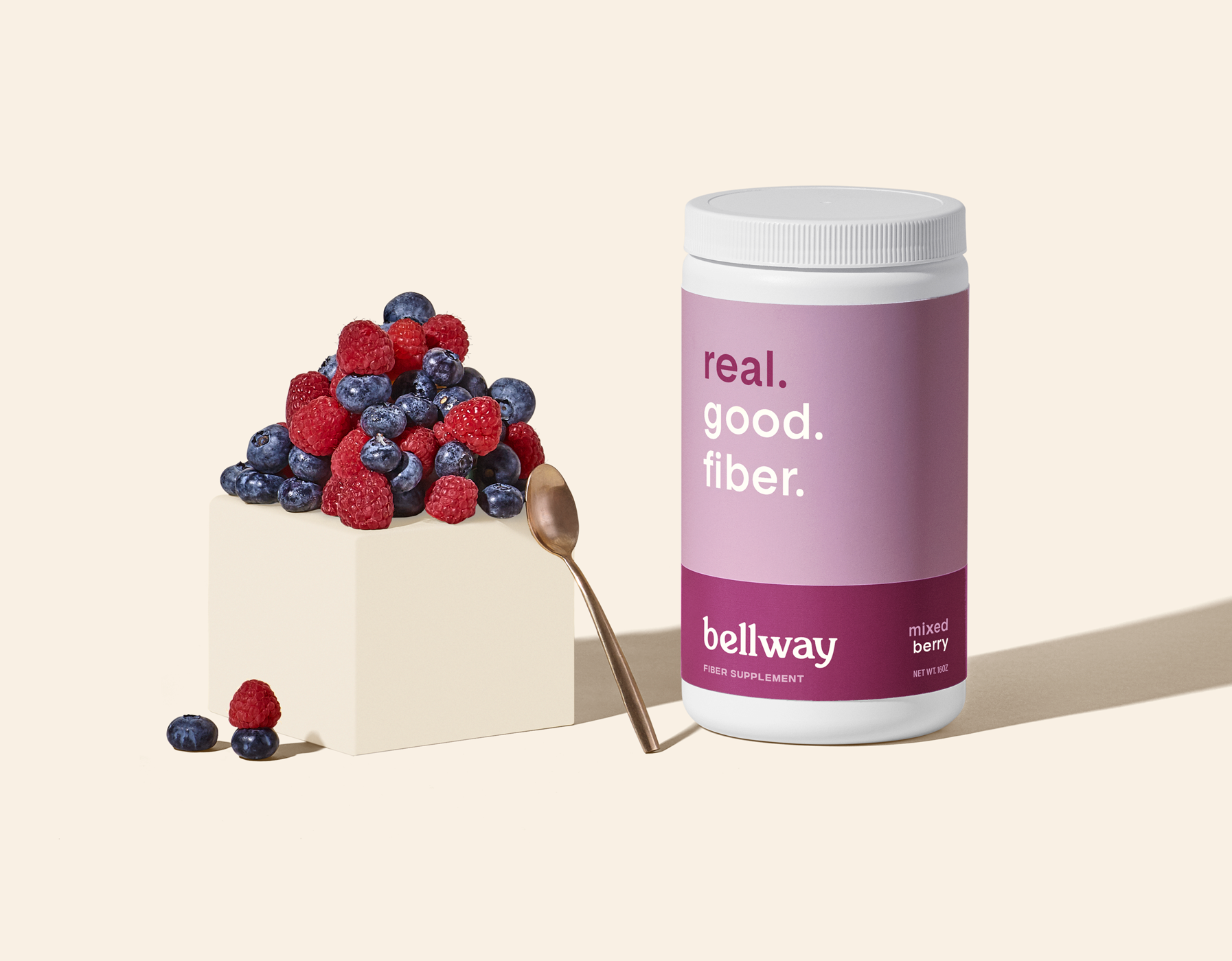
Bellway makes a daily fiber supplement from all-natural ingredients. Thanks to the myriad of health benefits fiber provides, Bellway is a product not just for older folks or those with digestion issues, but for anyone wanting to improve their overall gut health. We worked closely with Bellway to tackle the challenge of giving fiber the cool factor by creating a brand identity that appeals to a younger millennial audience while still conveying the broader benefits of fiber for all. We intentionally picked a voice-forward approach in order to make the product stand out on the shelf against existing grandparent fiber brands, with the use of fresh fruit in the product photography paying homage to Bellway’s all-natural ingredient list.
Scope
Art Direction
Brand Voice
Packaging
Print Collateral
Site Experience
Strategy
Visual Identity
Collaborators
Heidi's Bridge - Photography


Brand Manifesto
The evidence is clear: gut health is core to overall health. The trillions of friendly bacteria that populate our intestines play a crucial role in our digestion, our immune systems, and even our mood. It’s never been more important to nourish your gut. And it’s never been harder to do. Life is busy. We throw a lot of stuff at our bodies that they’re not equipped to handle, and the results can be... uncomfortable, to say the least. At Bellway, we’re not afraid to talk sh*t when it comes to your health. And we’re making it easier than ever to take care of your gut naturally with simple, clean, science-backed ingredients. Our products are good to the core, so you can be good to yours.
Bellway. Health on a gut level.


PRODUCT IMAGERY
The use of juicy, fresh fruit gives the product photography an energetic and lively feel—conveying what it’s like to have enough fiber in your diet.


PACKAGE DESIGN
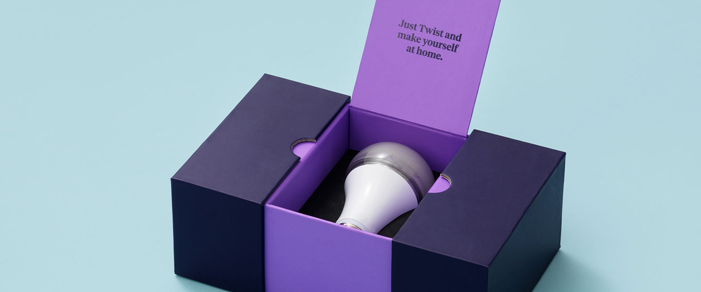
We created a simple yet bright and playful packaging experience that’s designed to speak to its audience from the shelf.


PACKAGE DESIGN
Using vibrant color-blocking with bold typeface to elicit a big billboard effect, the packaging not only indicates the flavor mash-up of each product, but also harkens back to the idea of balance.


Bellway is a voice-first brand with a down-to-earth, conversational style. To compliment the brand’s bold typeface, we used clean, colorful visuals that feel upbeat and lively.


